T-Shirt Design
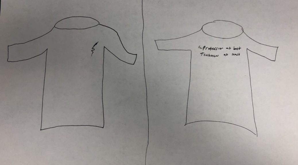
An impactful t-shirt is simple in design and has a clear catching message to it. Or on the other hand, has art can be interpreted in different ways that will provoke questions to people who view the shirt. I find that the text should be limit to very few words or one short sentence. No long paragraphs or complicated sentences. The shirt should be read within a simple glance at it. The text should go on the right side of the right on the upper pectoral muscle spot just below the neck, or along the upper back in bigger and bolder lettering. I find that a simple few words would go best for our shirt on the front while using an interpretable image on the back. Simple in design and can be understood within a glance or provoke a question. I think that simply either having PT Writing would suffice or something like “Professional at best, technical at least.” The color should be either black, grey, or navy blue with white lettering. The message is, however, you interpret it. I like it because it’s a ubiquitous phrase that can be used in a lot of contexts.